> ## Documentation Index
> Fetch the complete documentation index at: https://docs.mailgreet.com/llms.txt
> Use this file to discover all available pages before exploring further.
# Template Editor
> Master the Block-Based Email Builder in MailGreet with drag-and-drop blocks, styling options, and mobile preview
# Block-Based Template Editor
The Block-Based Editor is MailGreet's recommended way to create professional emails without any coding. Drag and drop content blocks, customize styles, and preview your design on desktop and mobile.
***
## Editor Overview
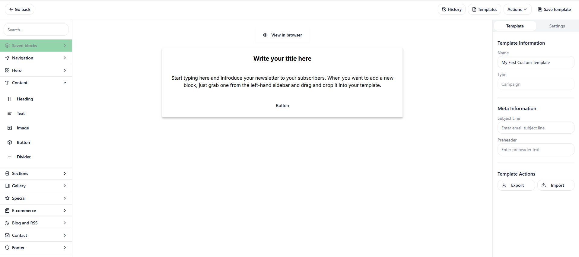
When you open the Block Editor, you'll see a powerful three-panel interface:
 ### Interface Layout
| Panel | Location | Purpose |
| ----------------- | -------- | -------------------------------- |
| **Left Sidebar** | Left | Content blocks and settings |
| **Canvas** | Center | Your email design area |
| **Right Sidebar** | Right | Styling options (Global & Block) |
| **Top Toolbar** | Top | Preview, actions, and save |
***
## Top Toolbar
The toolbar at the top provides essential actions:
Toggle editor theme
Undo/redo changes
Access saved templates
Additional options
### Preview Options
| Button | Function |
| --------------- | ------------------------------ |
| **Desktop** | Preview as desktop email |
| **Mobile** | Preview as mobile email |
| **Preview** | Full preview in new window |
| **Duplicate** | Create a copy of this template |
| **Export HTML** | Download the raw HTML code |
***
## Left Sidebar: Content Blocks
The left sidebar has two tabs: **Blocks** and **Settings**.
### Content Blocks
Drag these blocks onto your canvas to build your email:
Add paragraphs, descriptions, or any text content.
**Features:**
* Rich text formatting
* Variable insertion (`{{first_name}}`, etc.)
* Click to edit directly in canvas
Create prominent headlines and section titles.
**Features:**
* Multiple heading sizes (H1, H2, H3)
* Bold, eye-catching typography
* Perfect for email subjects
Add images to your email.
**Features:**
* Upload from computer
* Paste image URL
* Alt text for accessibility
* Link images to URLs
Create call-to-action buttons that drive clicks.
**Features:**
* Customizable text
* Link destination URL
* Background and text colors
* Border radius options
### Settings Tab
The Settings tab provides additional configuration options for your email template.
***
## Right Sidebar: Styling
The right sidebar has two tabs: **Global** and **Block**.
### Global Styles
Apply consistent styling across your entire email:
| Setting | Description |
| -------------------- | ----------------------------- |
| **Canvas Color** | Background color of the email |
| **Background Color** | Outer email container color |
| **Font Family** | Default font for all text |
| **Text Color** | Default text color |
Set your brand colors in Global Styles first, then customize individual blocks as needed.
### Block Styles
When you select a block on the canvas, the Block tab shows options specific to that element:
* **Font Size** — Text size in pixels
* **Font Weight** — Bold, normal, light
* **Text Color** — Override global color
* **Alignment** — Left, center, right
* **Padding** — Space inside the block
* **Background** — Block-specific background
***
## Working with Blocks
### Adding Blocks
Browse the Blocks panel in the left sidebar
Click and drag the block onto your email canvas
Drop it where you want it — above, below, or between existing blocks
### Editing Content
Click directly on any block in the canvas to edit its content:
* **Text/Heading**: Click to open the text editor popup
* **Image**: Click to upload or change the image
* **Button**: Click to edit text and link
### Reordering Blocks
Drag blocks up or down on the canvas to reorder them. A blue indicator shows where the block will be placed.
### Deleting Blocks
1. Select the block on the canvas
2. Click the trash icon that appears
3. The block is removed immediately
***
## Using Variables
Personalize your emails with merge variables:
Click on a Text or Heading block
The text editing popup appears
Type variables in the format: `{{variable_name}}`
Examples:
* {"{{first_name}}"} — Subscriber's first name
* {"{{last_name}}"} — Subscriber's last name
* {"{{email}}"} — Subscriber's email address
Variables are replaced with actual subscriber data when the email is sent.
***
## Preview & Export
### Desktop vs Mobile Preview
Toggle between preview modes to see how your email looks on different devices:
* **Desktop**: Full-width layout as seen on computers
* **Mobile**: Stacked layout as seen on phones
Always check mobile preview! Most emails are opened on mobile devices.
### Export HTML
Need the raw HTML code? Click **Export HTML** in the toolbar to download your email as an HTML file. This is useful for:
* Using the template in other systems
* Archiving designs
* Developer customization
***
## Saving Your Work
### Auto-Save
The editor automatically saves your changes as you work.
### Save & Return
Click the green **Save & Return** button in the top right to save and go back to the templates list.
***
## Best Practices
Begin with fewer blocks and add more as needed
Use headings to create clear content structure
Focus on one primary action per email
Preview on both desktop and mobile regularly
***
## Related Guides
Browse and manage your template library
Build templates with custom HTML
Use templates in your campaigns
Test before you send
### Interface Layout
| Panel | Location | Purpose |
| ----------------- | -------- | -------------------------------- |
| **Left Sidebar** | Left | Content blocks and settings |
| **Canvas** | Center | Your email design area |
| **Right Sidebar** | Right | Styling options (Global & Block) |
| **Top Toolbar** | Top | Preview, actions, and save |
***
## Top Toolbar
The toolbar at the top provides essential actions:
Toggle editor theme
Undo/redo changes
Access saved templates
Additional options
### Preview Options
| Button | Function |
| --------------- | ------------------------------ |
| **Desktop** | Preview as desktop email |
| **Mobile** | Preview as mobile email |
| **Preview** | Full preview in new window |
| **Duplicate** | Create a copy of this template |
| **Export HTML** | Download the raw HTML code |
***
## Left Sidebar: Content Blocks
The left sidebar has two tabs: **Blocks** and **Settings**.
### Content Blocks
Drag these blocks onto your canvas to build your email:
Add paragraphs, descriptions, or any text content.
**Features:**
* Rich text formatting
* Variable insertion (`{{first_name}}`, etc.)
* Click to edit directly in canvas
Create prominent headlines and section titles.
**Features:**
* Multiple heading sizes (H1, H2, H3)
* Bold, eye-catching typography
* Perfect for email subjects
Add images to your email.
**Features:**
* Upload from computer
* Paste image URL
* Alt text for accessibility
* Link images to URLs
Create call-to-action buttons that drive clicks.
**Features:**
* Customizable text
* Link destination URL
* Background and text colors
* Border radius options
### Settings Tab
The Settings tab provides additional configuration options for your email template.
***
## Right Sidebar: Styling
The right sidebar has two tabs: **Global** and **Block**.
### Global Styles
Apply consistent styling across your entire email:
| Setting | Description |
| -------------------- | ----------------------------- |
| **Canvas Color** | Background color of the email |
| **Background Color** | Outer email container color |
| **Font Family** | Default font for all text |
| **Text Color** | Default text color |
Set your brand colors in Global Styles first, then customize individual blocks as needed.
### Block Styles
When you select a block on the canvas, the Block tab shows options specific to that element:
* **Font Size** — Text size in pixels
* **Font Weight** — Bold, normal, light
* **Text Color** — Override global color
* **Alignment** — Left, center, right
* **Padding** — Space inside the block
* **Background** — Block-specific background
***
## Working with Blocks
### Adding Blocks
Browse the Blocks panel in the left sidebar
Click and drag the block onto your email canvas
Drop it where you want it — above, below, or between existing blocks
### Editing Content
Click directly on any block in the canvas to edit its content:
* **Text/Heading**: Click to open the text editor popup
* **Image**: Click to upload or change the image
* **Button**: Click to edit text and link
### Reordering Blocks
Drag blocks up or down on the canvas to reorder them. A blue indicator shows where the block will be placed.
### Deleting Blocks
1. Select the block on the canvas
2. Click the trash icon that appears
3. The block is removed immediately
***
## Using Variables
Personalize your emails with merge variables:
Click on a Text or Heading block
The text editing popup appears
Type variables in the format: `{{variable_name}}`
Examples:
* {"{{first_name}}"} — Subscriber's first name
* {"{{last_name}}"} — Subscriber's last name
* {"{{email}}"} — Subscriber's email address
Variables are replaced with actual subscriber data when the email is sent.
***
## Preview & Export
### Desktop vs Mobile Preview
Toggle between preview modes to see how your email looks on different devices:
* **Desktop**: Full-width layout as seen on computers
* **Mobile**: Stacked layout as seen on phones
Always check mobile preview! Most emails are opened on mobile devices.
### Export HTML
Need the raw HTML code? Click **Export HTML** in the toolbar to download your email as an HTML file. This is useful for:
* Using the template in other systems
* Archiving designs
* Developer customization
***
## Saving Your Work
### Auto-Save
The editor automatically saves your changes as you work.
### Save & Return
Click the green **Save & Return** button in the top right to save and go back to the templates list.
***
## Best Practices
Begin with fewer blocks and add more as needed
Use headings to create clear content structure
Focus on one primary action per email
Preview on both desktop and mobile regularly
***
## Related Guides
Browse and manage your template library
Build templates with custom HTML
Use templates in your campaigns
Test before you send